
TeeRagers
A bold, youth-centric clothing brand identity designed with the spirit of free artistic expression through contemporary design.
A bold, youth-centric clothing brand identity designed with the spirit of free artistic expression through contemporary design.
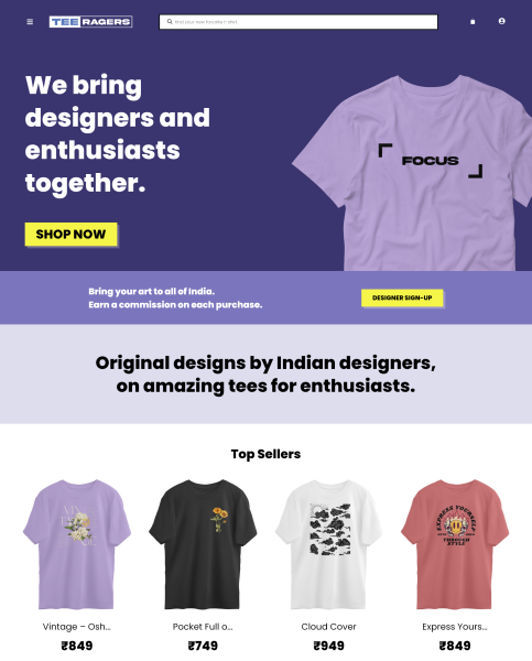
TeeRagers embodies the intersection of youthful rebellion and refined design sensibility. The brand identity leverages bold typography, vibrant color systems, and dynamic visual language to create an authentic connection with Gen-Z consumers.
My design approach prioritizes versatility across digital and physical touchpoints while maintaining strong brand recognition through consistent application of core visual elements and strategic use of negative space.
PRIMARY TYPEFACE
Poppins
SECONDARY TYPEFACE
Poppins
The typographic system combines bold, geometric headline fonts with clean, readable body text to establish clear visual hierarchy and enhance brand recognition across all consumer touchpoints.
Strategic logo applications ensure optimal visibility and impact across diverse contexts. Each variation maintains brand integrity while adapting to specific use cases and background requirements.

Primary
#3A356E
Secondary
#7B75BD
Accent
#F5F549
A carefully curated color system that balances vibrant energy with sophisticated restraint. Primary and secondary colors create dynamic contrast while maintaining cohesive brand expression.
Have a project in mind? Get in touch.